Communicating the frontiers of neuroscience through art
                                                                 |
 |
|||
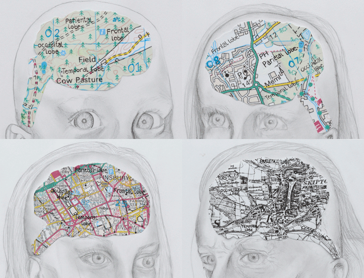
Mind Maps
|
|||
| Larger version of image (3MB), Comments from judges:
|
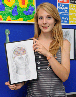 |
Seeing The Difference
2nd prize

Creativity versus Constraint
by
Taalib Minhas
Netherhall Sixth Form College
Entry in the category: Diversity or Disorder?
At first glance Einstein, Salvador Dali, Tony Hancock and Beach Boy Brain Wilson would seam to have little in common. Their areas of physics, modern art, comedy and rock music are light years apart. So what, if anything, could possibly link minds that gave the world the theory of relativity, great surreal art, iconic comedy and songs about surfing?
Research is showing the traits associated with different mental illnesses have different effects on creativity.
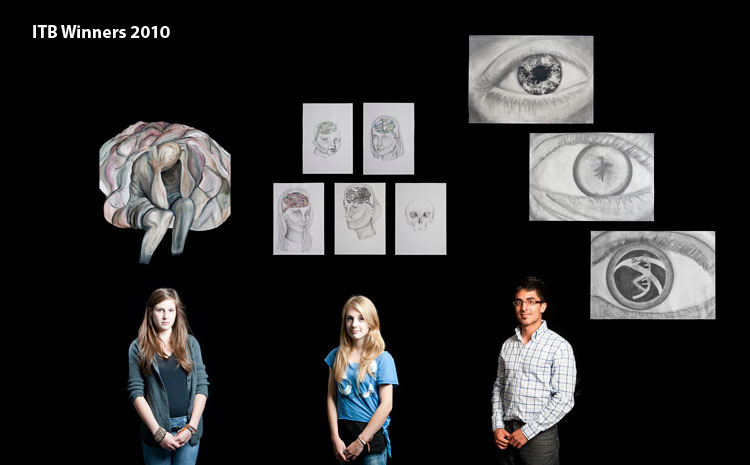
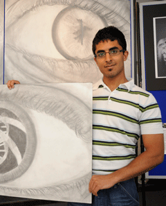
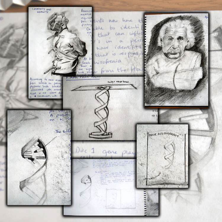
The right eye has a DNA helix in the pupil, and shows that it is possible to see one aspect of the true individual by looking at their DNA sequence, (that has only recently become possible for individuals). This code reveals all the imperfections and diversity between individuals. The restraining straps indicate how DNA to some extent constrains the person.
Larger version of left eye (1.5MB), right eye (1.58MB), another eye (1.6MB) Comments from judges: Picture of Taalib Minhas |
 |
Sketches and concept work by Taalib (large version (1.3MB))
Between You and Me
3rd prize
by
Nathalie Kantaris-Diaz
Parkside Federation
Entry in the category: Diversity or Disorder?
Notes from artist:
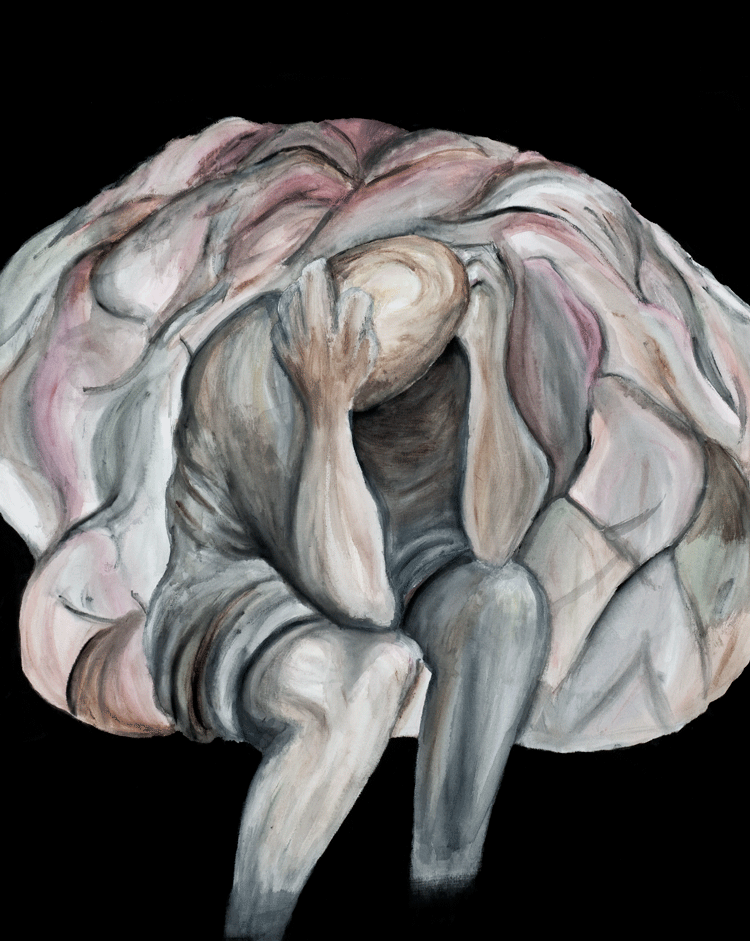
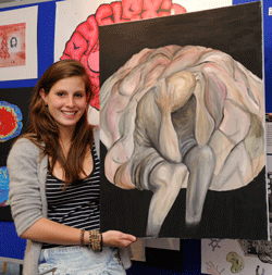
I wanted to convey a strong sense of empathy to the viewer as they see the tortured man in the painting and understand the strength of his feelings. I do not want the viewer merely to dismiss him as a man with a disorder. I wanted to show the diversity of his feelings within the subtle, varied colourings of the brain, but also to show how the absolute darkness of the background threatens to engulf any other feelings present in the painting.
Comments from judges: Large image (1.74MB) |
 |
Boxed In
Highly commended
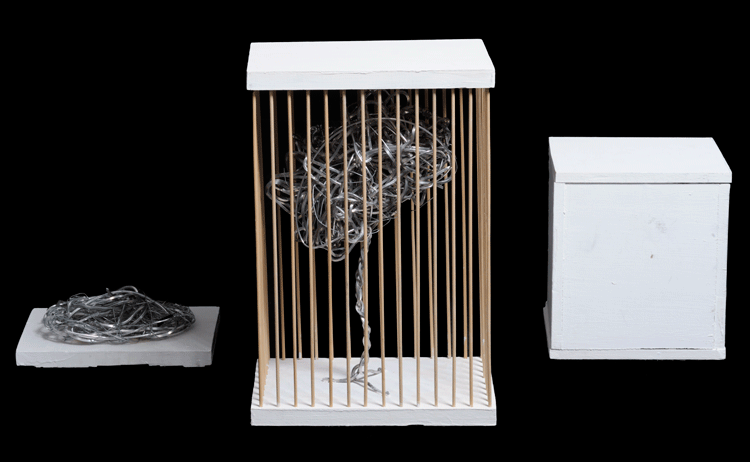
by
Max Street
Parkside Federation
Sculpture entered in the category: Diversity or Disorder?
Large version of above image (1MB)
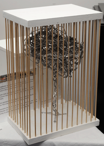
Notes on the work: These three sculptures represent the component parts of the human condition in accordance to Freudian psychology and the consequences of extreme imbalances in the constituent components.
The unboxed brain lacks structure and cohesion. This is the ego or self. Extreme self interest without the structure given by society, or Id, is centainly disorderly.
The caged brain represents the SuperEgo, the force which hold the Id and Ego in balance. This is the normal state of humanity, in balance.
The box represents the Id, or social conscience. In this case, the box is a barrier between the brain which lies in the box and greater actions. Having society to control ones life is also a form of disorder.
Picture of Max Street
| Comments from judges: Large version of image to the right (1.33MB) 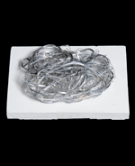
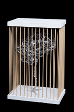
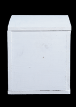 Unboxed brain, Caged brain, Box with brain inside Larger Images left (0.6MB), middle (1.3MB), right (0.6MB) |
 |
Scanning Beyond the Flesh
Highly Commended
by
Mu-Chun Chiang
The Leys
Entry in the category: St(Ages) of the Brain
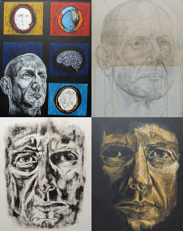
Artist's comments: Developing the use of brain scans and overlays to portray emotional development and sequence of thought. Strong influences from Susan Aldworth when experimenting with looking into the brain.
Larger view of 1 (1.6MB), 2 (1.38MB), 3 (1.81MB), 4 (1.87MB)
Collection of supporting work: pictures and slideshow
Comments from judges:
Not really clear how the different how the different drawings link up.
Outstanding drawing skills.
Gorgeous images, great to look at, but not very related to the topic.
Fantastic ability and talent.
Susan Aldworth? Cogito ergo sum many artists references in style.
Very strong artistic skills.
Obsessive Compulsive Disorder
Highly Commended
by
Megan Rich
Parkside Federation
Picture entry in the category:
Diversity or Disorder?
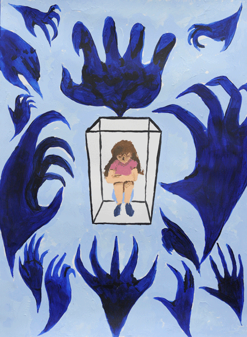
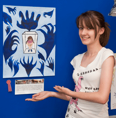
Notes on picture: This picture is mainly about OCD (Obsessive Compulsive Disorder) and how some people who have it feel. The girl in the box represents the mind trapped and the hands around it represent a sort of demon or other thought. It is a bit like another voice controlling your thoughts. This concept is very close to me and I hope I get a clear message across.
Comments from judges:
Its a powerful image.
This is good, communicating how this disorder may affect mind.
Good composition; clear and bold.
The artist has selected the disorder, leaving no questioning for the viewer, however, it is personal and strong.
Exhibits below have been entered under the category:
Diversity or Disorder?
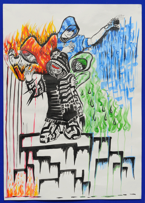
Superheroes
by
Charles Tacadena
Netherhall Sixth Form College
Entry in the category:
Diversity or Disorder?
Comments from judges:
Mangaesque characters exhibiting emotion are well drawn.
I like the superhero aspect very pop culture and taps into the positive and negative aspects of the theme.
Good composition and colour.
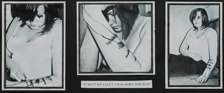
"It isn't my fault"
by
Juliette Koch
Parkside Federation
Entry in the category: Diversity or Disorder?
Comments from judges:
I would have liked to have seen this image on photographic paper.
Comment very apt to brief: It isnt my fault, I was born this way.
Good for mix of tension in the theme born or made labels.
Thought in composition and arrangement a little unbalanced would prefer images to tell the story without text.
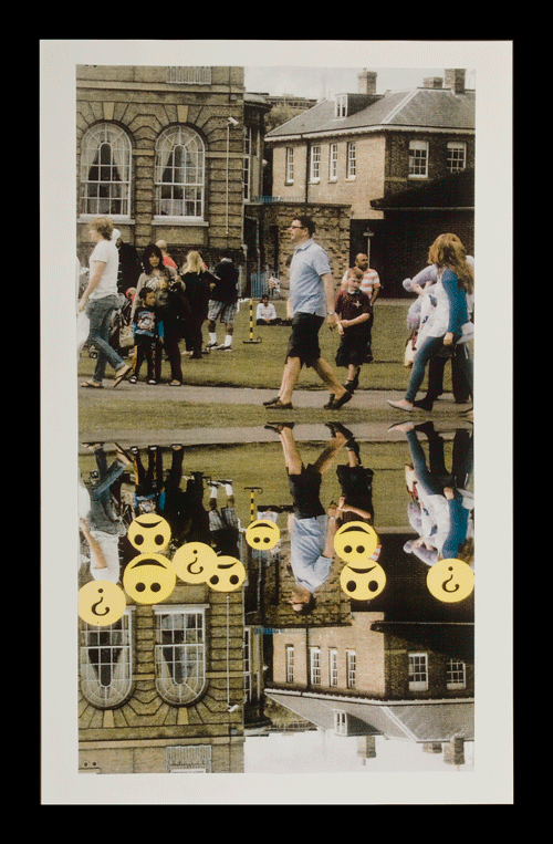
Emoticons
by
Anisa Sheikh
Parkside Federation
Entry in the category:
Diversity or Disorder?
Painter comments:
For my piece, I have chosen to focus on diversity or disorder. My piece is based on a type of autism, when they cant tell other peoples emotions; they can only understand happy and sad. Autism can be seen as a disorder or a diversity as autistic people have a problem and this makes them different. In this piece, it shows people walking casually, then underneath is an interpretation of what autistic people can see. I have used big yellow faces to show peoples emotions: happy, sad, or, he doesnt know?
Comments from judges:
Nice idea simple in a good way. Could have been refined in use of smiley faces, good choice of photo.
A clearly expressed idea that des not fully address the question.
This is a good communication, drawing attention in a very simple way to a problem associated with autism.

Out of the bag
by
Sam Boevey
Parkside Federation
Entry in the category: Diversity or Disorder?
Comments from judges:
Brings out the idea of things getting more junked up as you get older but otherwise hard to understand given the topic.
Full brain ageing? I would have liked to have seen how the artists thoughts developed.
Nicely presented plastic bags are not easy to draw!
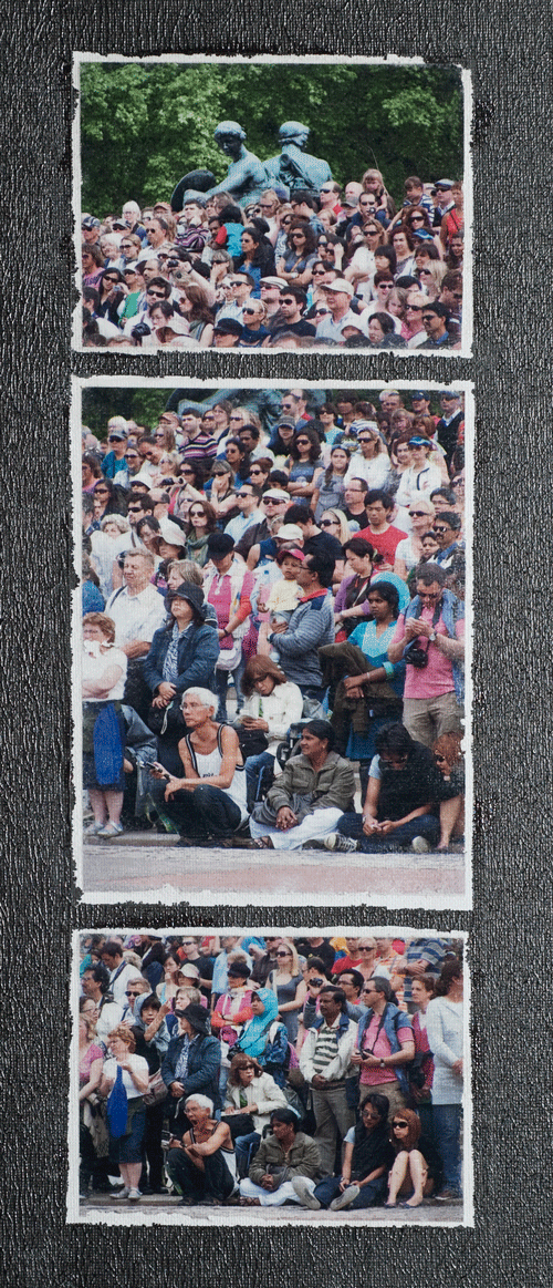
Ninety-nine people and one wheelchair
by
Dalma Kadocsa
Cambridge Regional College
Entry in the category:
Diversity or Disorder?
Painter comments:
I am normal. You are different.
My idea was to show how different people are and also to make the point that if you have a disability that doesn't mean you are not normal. Just different.
Comments from judges:
Isolation of wheelchair user well illustrated. Fab creative skill liked a lot!
The format & mix of photography & canvas was lovely.
The idea and the presentation are very successful.
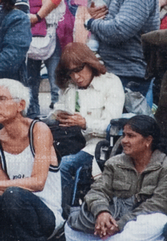

The Minds I
by
Corinne Girling
Netherhall Sixth Form College
Entry in the category:
Diversity or Disorder?
Painter comments:
This piece was inspired by autism, and the difficulty people with autism have making eye contact led me to wonder if an eyecatching composition should connect the eyes.
Comments from judges:
Imaginative, colourful, nice use of mixed media. Falls short without the write-up.
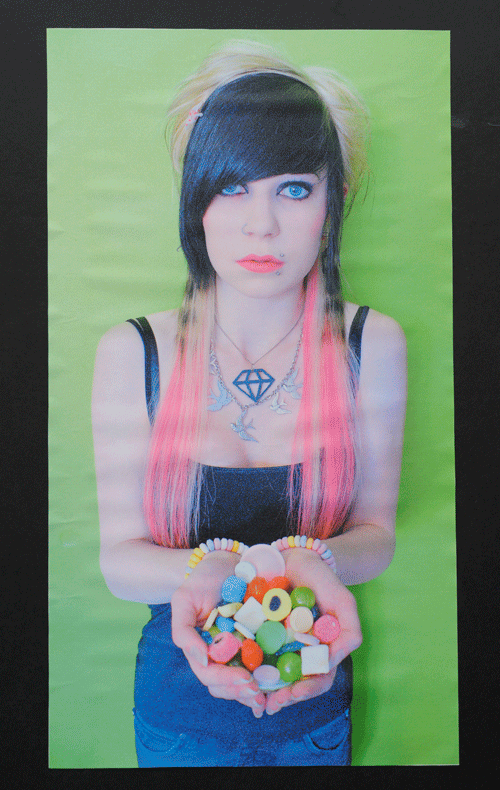

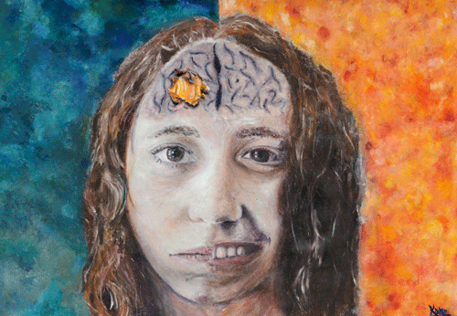
Jane
by
Kate Kelly
Parkside Federation
Entry in the category:
Diversity or Disorder?
Artist's comments:
This painting is of Jane, she has Bipolar. Her bipolar interested me and I wanted to show her two sides and how the disorder affected her. I was also inspired by the TV advert of the man having a stroke, I thought that could also show bipolar in the brain. The burning and eating away the flesh gave me the idea to have the ripped canvas. I did this because we can then look inside at her depressed side and see how she feels inside.
Comments from judges:
This approached the question of diversity & disorder well.
Confident approach to the subject.
Bipolar/stroke confusing.
Like the smile/sad dichotomy, but not original to have two halves of face.
Nicely done, like the torn canvas.
Eye-catching and brings out the idea of a bipolar brain very well.
Outstanding technical skill.
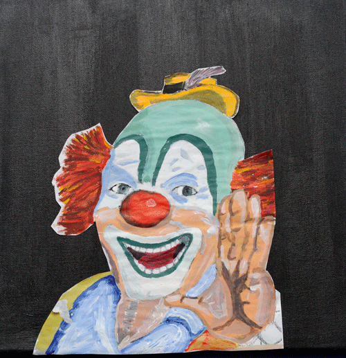

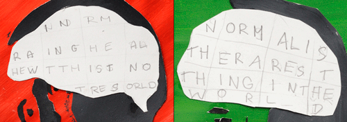
"Normal is the rarest thing in the world"
by
Charlotte Wiffin
Parkside Federation
Entry in the category:
Diversity or Disorder?
Comments from judges:
Like it eye-catching need to look again arresting.
Great use of colour/text/graphic.
Could be refined, the idea is stronger than the execution.
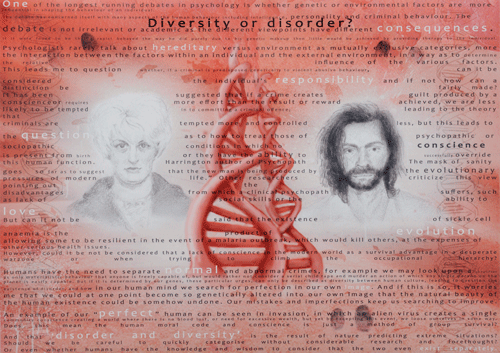
Hindley, Manson, You?
by
Emma Rouse
Cambridge Regional College
Entry in the category:
Diversity or Disorder?
Comments from judges:
Too wordy the highlighted words still didnt explain the choice of portraits.
Time and thought have gone into this not sure if it works, but like the ambition. A very striking image.
Text communicates and asks questions but is hard to read could be larger.
Anorexia and Obesity
by
Ciara Byford
Parkside Federation
Entry in the category:
Diversity or Disorder?
Artist's comments:
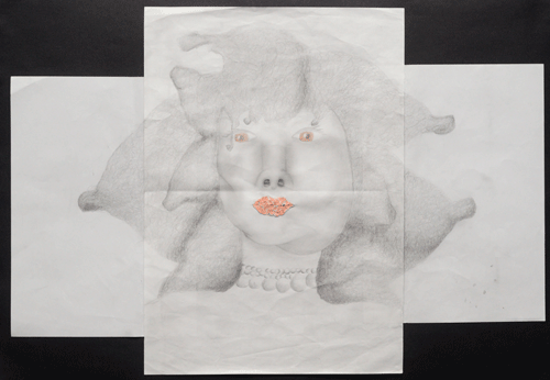
My idea was to try and show the similarities and differences between anorexia and obesity. They are both eating disorders for people that dont have much confidence or confidence issues with their looks but are both opposites. One forces the person to lose a lot of weight by not eating and the other makes the person overeat because they intake too much food.
Comments from judges:
I dont see anorexia/obesity in this image and Im not sure about the choices in the use of materials.
Enigma
by
Hannah Sell
Parkside Federation
Entry in the category:
Diversity or Disorder?
Artist's comments:
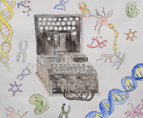
My painting uses the Engima machine to represent diversity and disorder of genes. An Engima machine is a device that decodes plain text messages. This was used in world war 2 against the Germans, this helped end the war. The way the Engima machine links to genetics or genetic codes is how the machine works by using the correct routes you will get a specific translation, this links to genes inherited from parents, the diversity, however there are millions of combinations which do not make sense if wrong linkages are used for example, to mutating genes.
Comments from judges:
Nice idea, some real thought involved.
I like the lightness of the floating forms and pale colours; well expressed.
The idea is good, but somehow the machine and biological bits dont link together well.
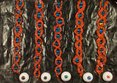
Comments from judges:
Nice! I like the yellow to show the exception. Well understood and expressed interesting composition, like the repetition. Technically good, could have been refined.
Strong scientifically: brings out the message that one mutation can make all the difference.
I, Mutant
by
Lisa Johnson-Davies
Parkside Federation
Entry in the category:
Diversity or Disorder?
Artist's comments:
The idea behind my piece is that everyone looks completely different on the outside, but if you delve deep enough, to the molecular level, one person's DNA looks almost identical to the next. I have used eye colour as an example, to show that even a person born with Albinism, which creates a drastic difference in appearance, will have the same DNA as someone with normal pigmentation, with the exception of just one base pair.
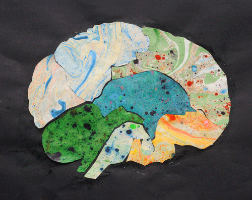
The Marbled Brain
depicting diversity in the brain
by
Yancen
Parkside Federation
Entry in the category:
Diversity or Disorder?
Comments from judges:
Different parts of the brain do different things?
Like the colours, nice use of collage, striking on the black. The finish could be tidier; the glue spoils the final effect.
Beautiful presentation, but hard to see the message.
Brain orientated questions brain activity.
A strong image would have been more effective with write-up and less glue.
Like the marbled paper.
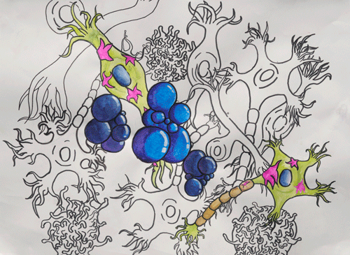
The Neuron Network
by
Bailey Li
Parkside Federation
Entry in the category:
Diversity or Disorder?
Comments from judges:
This is eye-catching, but the message is not clear.
Prefer it in reproduction. Cartoon-like and quirky, good fun, nice to see something positive. Lovely balance of black & white to colour.
Schizophrenia
by
Anna Holbrook
Parkside Federation
Entry in the category:
Diversity or Disorder?
Artist's comments:
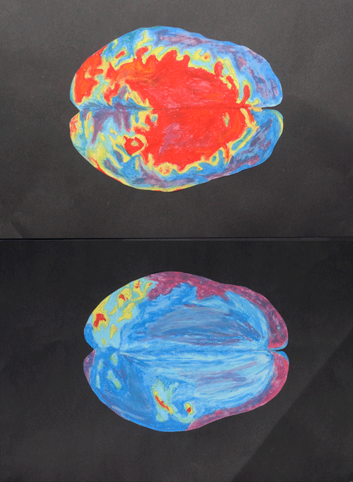
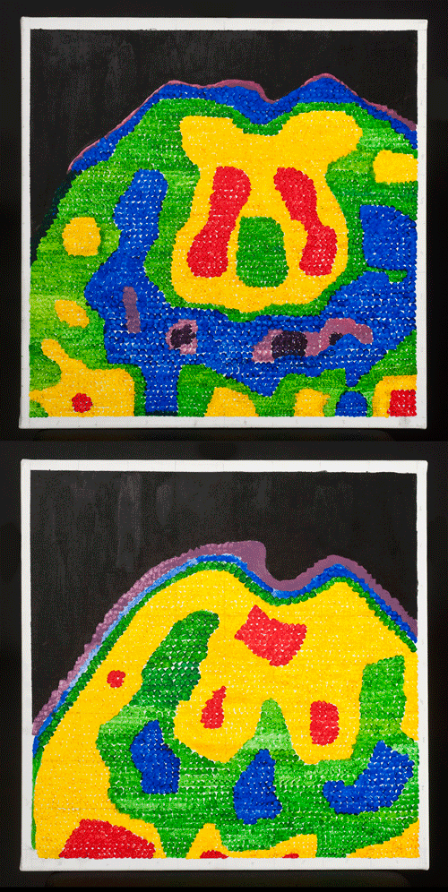
I chose the theme Diversity and Disorder as the subject for this piece which consists of two paintings. Each painting represents a magnified section of a brain scan, one of a healthy brain and one of the brain of a patient affected by Schizophrenia. I envisage the viewer taking time to contemplate the diversity of the two pictures, eventually discovering the disorder created by the differences between the two brains.
Furthermore, through this piece I wanted to illustrate the correlation that exists between art and science. By painting the pixelation caused by the magnification of the brain scan I am referencing the scientific element that exists on the computer generated picture in its original form, but also the artistic interpretation of scan data. I have used acrylic paint to mimic the extraordinarily vibrant colours which occur in a brain scan.
Comments from judges:
Interesting presentation & idea but the differences are not subtle enough.
Nicely done, like the pixilation a lot; adds something.
Patience has been shown in the use of colour, a lot of thought and expression has gone into this.
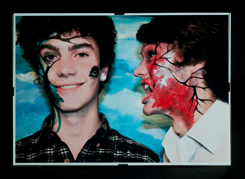
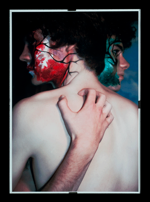
The Lovers
by
Candace Lipscombe
Impington Village College
Entry in the category:
Diversity or Disorder?
Larger version of top image (1.27MB)
Larger version of bottom image (1.19MB)
Artist's comments:
My photography project took the title of The Lovers. These pieces are an exploration of the concept of living with a mental illness and mainly focusing on bipolar and the two contrasting and completely destructive states in which the illness manipulates ones mind to feel almost terrified by the impulsive nature of the illness. The red male represents the depression at its deepest and most destructive, the model is actually my partner and this is relevant to the sense that living through my own life with bipolar I feel a sense of my illness through the man I share it with, we embrace it together and in someway explore it through time. The green male is also relevant to my own personal experience, he is a best friend through the worst parts of discovering the depression and the green highlights this sense of sanity and in a way this image of excitement and exploration - the green embracing nature and tranquillity. I have used the title of The Lovers, to show this rather obsessive and almost romantic quality in which bipolar illuminates, leaving a being almost unable to liberate themselves from the illness, as if like a destructive lover, being almost hooked on the almost electricity of life. Like the photography, the two sides work together, to form this illness - like the image of Heaven and Hell.
Comments from judges:
Like the face-paint, but I dont think it expresses the point.
Photographu/photoshop mix portrays bipolar.
The photographs look interesting and make you want to read more, so it is a good communication.
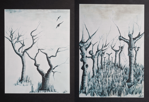
Van Gogh
by
Beatrice Carrigan-Maile
Impington Village College
Entry in the category:
Diversity or Disorder?
Larger image left (0.78MB), right (2.41MB)
Artist's comments:
I became aware of your project at the beginning of my A Level course and felt that it fitted in well with my ideas on Van Gogh and his physical state during his life. Most of my own pieces relate to post impressionist work. However I also focus of the works of modern photographers and how images adapt and display surrounding in certain contained ways.
Comments from judges:
Stunning, gorgeous images, but not on target.
Lovely, very good understanding of Van Gogh, but the artist has made it their own.

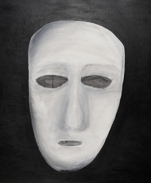
No Personality Disorder
by
Oriana Wallace-Johnson
Netherhall Sixth Form College
Entry in the category:
Diversity or Disorder?
Artist's comments:
The idea for my mask piece was connected with Multiple Personality Disorder (or Dissociative Identity Disorder), and relates to the person with the condition having many personalities and masking their real personality. Also my piece links to barriers as people with Multiple Personality Disorder may have their other personalities as a barrier from tough situations, intense emotions and society in general.
Comments from judges:
Needs description and could attempt to give a clear message.
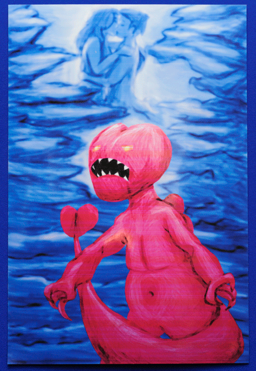
Love as a Disorder
by
Alex Anderson Perrott
Netherhall Sixth Form College
Entry in the category:
Diversity or Disorder?
Artist's comments:
This piece was my take on love as a disorder, and the similarities between the effects of certain drugs and love, ranging from romantic, to platonic, to limerence (child-hood crushes that are normally from our first hints at sexual desire but not knowing what sex is).
This design was inspired by a cartoon image by Twolia called War on drugs which was posted on a blog of his and his opinions of the war on drugs. My image was made with the idea in mind of what would the war on drugs look like in Twolias case if love was classified similarly to drugs such as cocaine, marijuana, ecstasy, hemp and others similar.
Comments from judges:
Love as a disorder very funny I like it!
Dont know how close this is to the source material nicely done.
It works as an image playful!
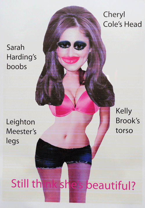
Still think she's Beautiful?
by
Rachel Topham
Netherhall Sixth Form College
Entry in the category:
Diversity or Disorder?
Artist's comments:
This piece came from my initial thought of when does diversity become grotesque and does it always have to or can we simply be a diverse nation. I have chosen body parts of female celebrities that are deemed to be beautiful. However I have been experimenting with whether too much beauty and diversity of body parts can become unattractive. When asking a man on the street if he would like Cheryl Coles head, Kelly Brooks torso, Sarah Hardings boobs. Leighton Meesters legs, Abbey Clancys eyes and Angelina Jolies lips together they instantly reply yes because of todays social ideals. But upon seeing the body parts physically meshed together the answer may be considerably different.
Comments from judges:
Interesting piece, but should be more focussed on the brain.
Not entirely original.
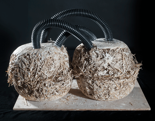
Brain Hemispheres
by
Jem Taylor
Impington Village College
Entry in the category:
Diversity or Disorder?
Artist's comments:
The two spheres represent the two sides of the brain. The tubes connecting the spheres are links like thoughts and divides. The material choice represents the disorder with the use of plaster and straw, which gives looseness and a messy affect. The materials are also not perfected to give an incomplete sense, as if there is something missing. They are also monotone colours to show lack of energy and thought.
Comments from judges:
I like the weirdness & originality, but does not communicate the science.
Left/right brain analogy & messiness only indicates disorder & not diversity.
Good use of unexpected materials, arresting to the eye.
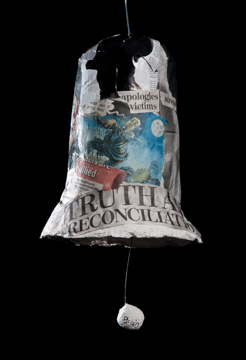
The Brain in Balance
by
Rachel Taylor
Parkside Federation
Sculpture entry in the category:
Diversity or Disorder?
Artist's comments:
To represent diversity and disorder I chose to make a bell shape out of wire and modrock, with a brain suspended in the centre and newspaper and magazine articles relating to the brain or disorders pasted on the outside. This was to represent how, when balanced in the centre of the bell, the brain is fine, however too much in one direction then there are problems, autism, OCD and memory problems for example. This can also open the brain to secondary problems like stress or bullying.
This links to diversity and disorder in that, when the brain is in balance, or only a little to one side, the differences are diverse they make us different, but when the brain hits the edge it becomes a disorder.
Comments from judges:
Original, interesting.
A nice idea, good to see something different, the metaphor falls down a bit but points for creativity. Brain too small, though.
Interesting, imaginative presentation that delivers the message clearly.
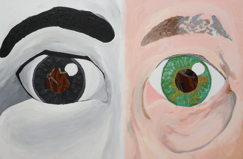
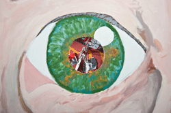
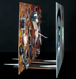
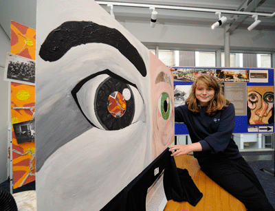
Looking through the older eye (right) one sees the distorted memories affected by old age and disease
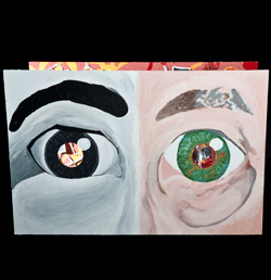
Maya with her work
The Eyes are the Window to the Soul
by
Maya Karpowicz
Parkside Federation
Entry in the category:
Diversity or Disorder?
Larger image Top (1.13MB)
Larger images middle Left (1.13MB), right (1MB)
Larger images bottom Left (1.13MB), right (1MB)
Artist's comments:
I believe that fragments of the soul reside in our memory. This piece graphically illustrates how our brains and memories are both affected by and live on despite the damaging neurological onset of Alzheimers Disease/dementia.
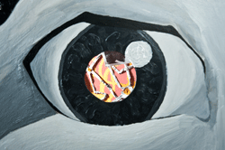
From personal experience of having a grandmother who has fallen victim to dementia/mild Alzheimers for the past seven years, here you can peer into the young black and white style photobased eye of my grandmother into her younger, unaffected by Alzheimers memory consisting of photos from her life and in colour her older eye affected by old age and her disease. Through this eye you can see into her distorted memory of ripped and burnt photos that express the deteriorating power of the strokes that dementia victims experience before they are cursed with that disease. The sudden change in my Grandmothers physical and mental state portrays a most powerful adaptation of diversity and disorder.
Comments from judges:
Good presentation of the science. Makes you want to look further.
Imaginative work.
Not really diversity, but a fantastic communication of Alzheimers.
Complex, good level of finish I would have colour for the memories and black & white for the present, though.
Very good realisation by use of a journey.
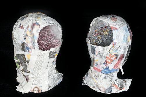
Normal?
by
Morgan Roux
Parkside Federation
Entry in the category:
Diversity or Disorder?
Larger image 1 (1.35MB)
Larger image 2 (1.3MB)
Artist's comments:
My piece is about how people can appear normal on the outside but be suffering with a disorder on the inside. The two brains in my sculpture represent a normal brain and an autistic brain. The normal brain is a single colour and the autistic brain is multicoloured.
Comments from judges:
Interesting use of coloured wire to denote an autistic brain.
Good use of 3D materials.
Heads could have more detail and the work is somewhat messy.
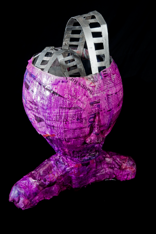
The mental Rollercoaster Brain
Bipolar Disorder
by
Sara May
Parkside Federation
Sculpture in the category:
Diversity or Disorder?
Artist's comments:
A guy with a roller-coaster instead of a brain to show the ups and downs of someone with bipolar disorder.
Comments from judges:
Literal, but I like the colour.
A lot of effort good level of finish.
Addresses topic from disorder perspective not questioning. However, the roller coaster analogy for bipolar is strong and the sculptural formation of the head is well done.
Other images 1 (1.55MB), 2 (1.09MB), 3 (1.22MB)
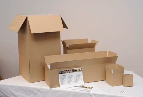

Behind the Eyes
by
Jessica Platt
Parkside Federation
Entry in the category:
Diversity or Disorder?
Larger image top (1.09MB)
Larger image bottom (1.4MB)
Artist's comments:
My piece consists of five boxes in varying sizes and shapes. They are all plain on the outside, and most of the interiors are pure white. One, however, is different and the inside is decorated with a piece of abstract art that uses strong colours and lots of metallic paints. This box was the one I made average size, and looks like the most stereotypical cardboard box of the whole installation. I have used these boxes to illustrate the hidden disorders that some people experience, and the way that no one can see it from a distance and have to look very closely to see the true turmoil that could be going on inside.
Comments from judges:
Box idea representing disorder unrecognised/under wraps. Why colour? is colour the disorder or diversity?
Good conceptual work.
The scientific communication is a little abstract, but I like this installation!
Esoteric in a good way. Needs more focus on the finish, however.

A World in One's Mind
by
Lucie Hilton
Parkside Federation
Entry in the category:
Diversity or Disorder?
Artist's comments:
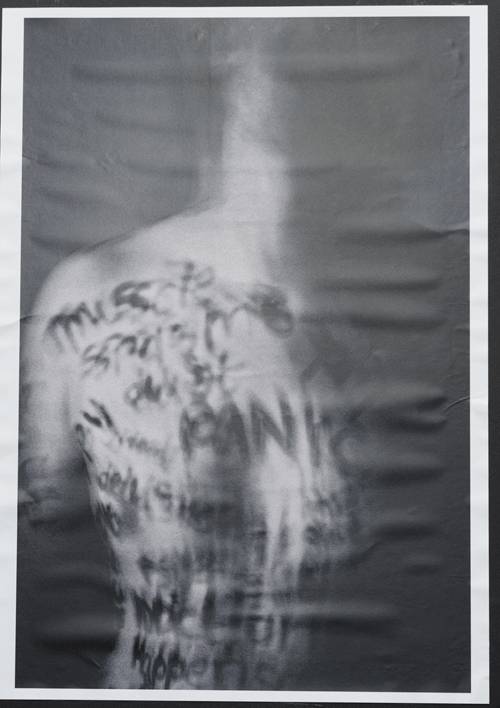
My work is based on diversity and disorder, I based my piece on autism and mental illness, in my opinion having a mental illness or autism is a good thing because the way you see the world is so different from how anyone else would see it, and I find it really magic how they create this own little world in their mind which they can retreat to. Pulse people often say that people with mental illness or autism have trouble connecting to other people and when I hear the word connecting I think of wires, and that is what I have tried to portray in my piece, my piece is a boy that has been taken over by his diversity and it has been turned into a disorder, the wires symbolize ideas and connection they are spreading out and expanding but yet they are broken and not connecting to anything.
Comments from judges:
This is a nice composition & makes us think about the complexity of the brain and what happens when it goes wrong.
Lovely format, nice idea. Social element missing about how these thoughts dont connect with people.
Good use of space.
Strong description. The large format is impressive
Exhibits below have been entered under the category
St(Ages) of the Brain
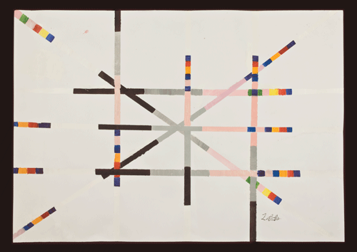
Interconnections over a lifetime
by
Zoe Cater
Parkside Federation
Entry in the category:
StAges of the Brain
Artist's comments:
My final piece is on stages of the brain. I chose to do colours that represent what stage of life that people are in. The white line is to represent a baby in the womb, (not born yet), the colours when you are a child because you dont have to worry about anything. The pink is to represent your teenage years because most teenagers have relationships, so I thought pink would be appropriate. The grey is to represent nearly dying, and the black is when you are dead. I did loads of lines to represent loads of people.
Comments from judges:
Good concept and use of colours. A cleaner response would have improved it."
Good communication when accompanied by description. The finish needed more attention, but nice idea.
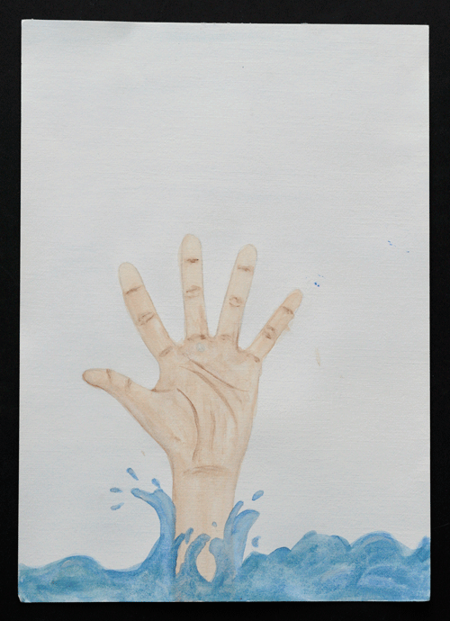
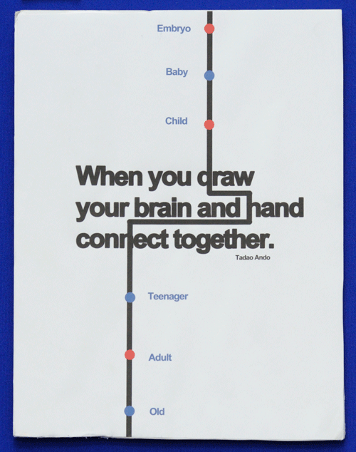
Tadao Ando
by
Chester Meldrum
Cambridge Regional College
Entry in the category:
StAges of the Brain
Comments from judges:
I like the sentiment not sure how it connects to the brief.
Gorgeous, great font, graphic & colour.
Strong, nice finish, would change old & embryo.
Clean graphical presentation, but write up would have provided more detail.
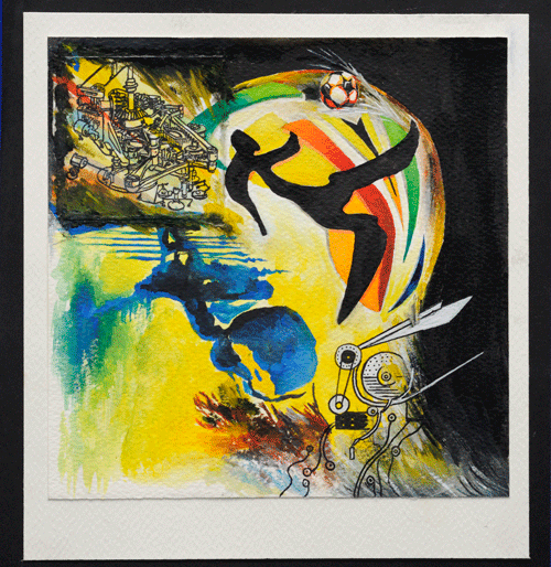
Miniature World
by
Reyshandno Luximon
Netherhall Sixth Form College
Entry in the category:
StAges of the Brain
Comments from judges:
Lovely, slightly surreal combination of ideas/structures/images.
An accomplished & effective composition, but not on topic? Body-mind link ? football. Would have liked to see development of ideas.
Love is Blind
by
Dora Kemplinska
Netherhall Sixth Form College
Entry in the category:
StAges of the Brain
Artist's comments:
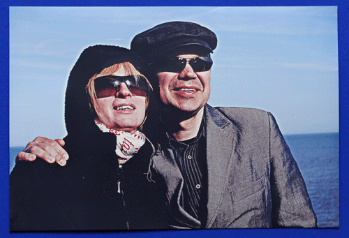
Love is blind and could also blind us. Often people while they are in love they forget about important everyday matters, such as wearing or not wearing sunglasses for instance, which can even cause you eye cancer. Love influences our brain it could even change our usual behaviour, but all everyday activities should be done with awareness. Taking care of eyes, physical body is important, because love cannot feed you, cannot provide you anything else but love, warmth and affection.
I have taken this photograph of my parents during the sunny afternoon at the seaside. Afterwards it was edited in Photoshop to get this very sharp and crisp vision.
Comments from judges:
A bit off topic but love the photo. Interesting interpretation of love.
Photo not quite centred.
Blowing Your Mind
by
Jake Howell
Parkside Federation
Entry in the category:
StAges of the Brain
Comments from judges:
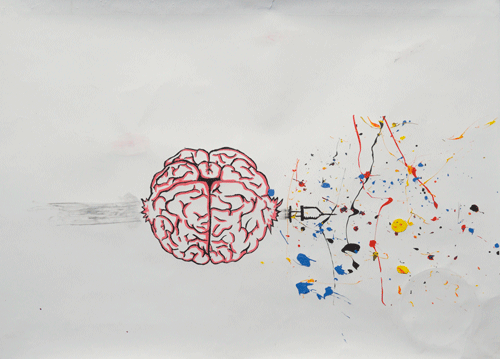
Eye-catching presentation, but hard to understand the message.
Dont do drugs!
Nice take on the bullet through the apple.
More time/care needed, not enough effort on the finish.
Original concept, adept use of materials.
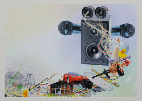
Life's Journey
by
Peter Matthess
Cambridge Regional College
Entry in the category:
StAges of the Brain
Comments from judges:
Greed is good?
Original, strange composition. I liked the fact that I needed to spend time figuring it out. Weirdly materialistic. How do the colour/sparkles relate to the objects?
Brain informed by experiences/objects/stages of life.
Highly skilled use of photoshop to create collage. Good components/professionally handled.
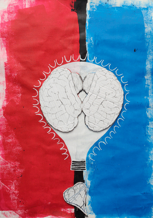
Lighten Up!
by
Nathaniel Neal
Cambridge Regional College
Entry in the category:
StAges of the Brain
Comments from judges:
Interesting presentation but needs an explanation.
Aspect of angry/agony/love. Analogy with lightbulb/brain broken heart/brain
shows integrity and questioning .
In two minds? Torn to make a decision?
Different I like the combination of forms.
Would prefer a cleaner finish on the raised parts.
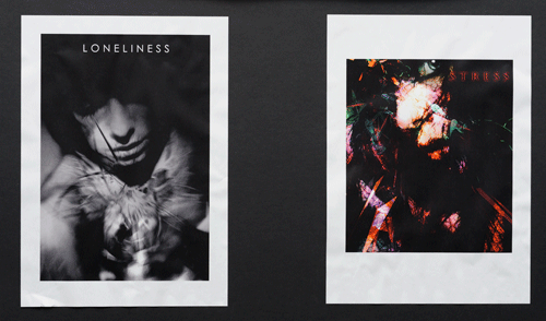
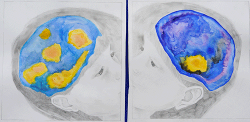
Depressed Brain
by
Sophie Taylor
Parkside Federation
Entry in the category:
StAges of the Brain
Artist's comments:
This is a picture of the same girl with depression and without. I chose to do her brain in water colour so it would stand out and you can see all the variety of colours in each of the brains. I did the rest of the picture in black and white as it would have looked too much with two different colourings.
Comments from judges:
What is this showing in the child?
I like the use of pencil & colours fantastic feathering of water colour.
If this shows aspects of depression, is the artwork showing diversity/disorder or Stages of the brain?
Adept use of watercolour/pencil work.
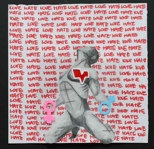
Love
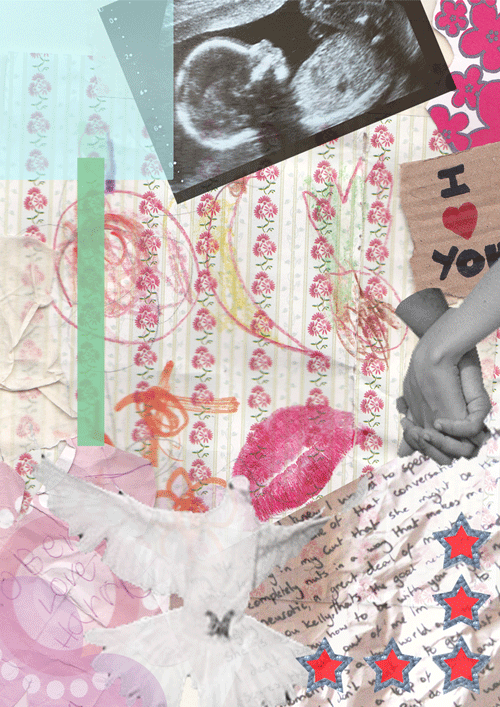
Hate
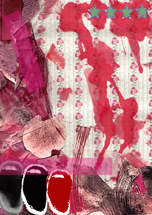
Dimensions of Love
by
Ben Platt
Cambridge Regional College
Entry in the category:
StAges of the Brain
Larger version of Hate (4.57MB)
Larger version of Love (2.33MB)
Comments from judges:
Liked the two images. Rich use of layers. Would like to see the originals.
Off topic but creatively great. I like the time needed to decode it. Nicely ambiguous. Shame it is A4 would have preferred larger and mounted, but very well constructed images.
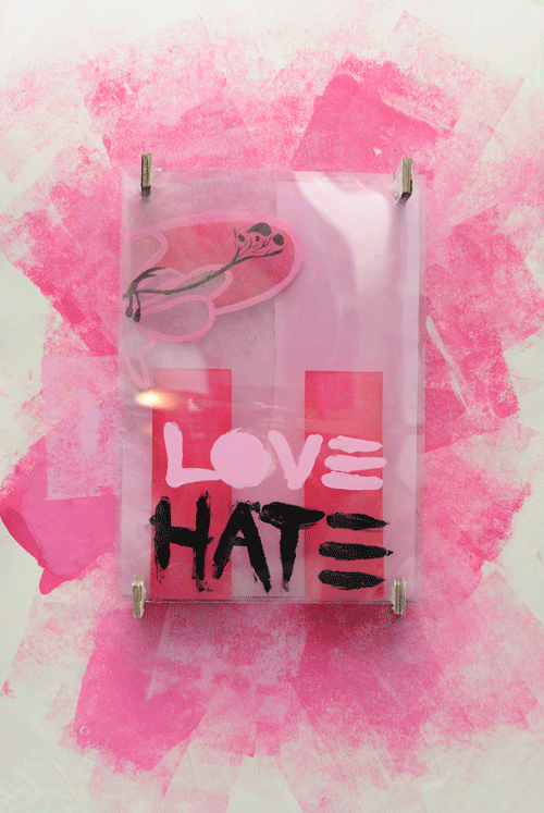
Projecting Emotions
by
Alex Wilde
Cambridge Regional College
Entry in the category:
StAges of the Brain
Comments from judges:
I like the experimentation with mixed media, but it isnt saying enough.
Link to brain layers?
Interesting conceptual piece. Layered images create 2D/3D concept putting love & hate on the same level?
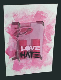
Side projection to see layering in the work
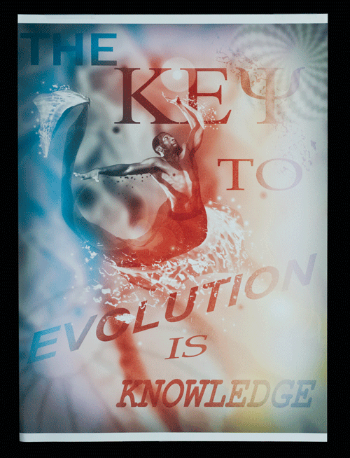
The Key to Evolution is Knowledge
by
Anthony Richards
Cambridge Regional College
Entry in the category:
StAges of the Brain
Comments from judges:
Neural abstraction layered with text. Do not necessarily see the stages.
Strong graphical quality, high level of photoshop manipulation.
Like the colours and layers used. The composition needs some work and the message is confusing.
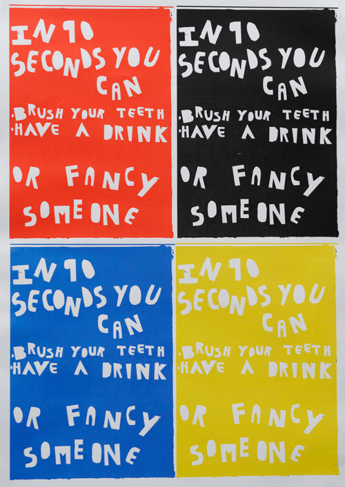
In Ten Seconds
by
Jordan Minet
Cambridge Regional College
Entry in the category:
StAges of the Brain
Comments from judges:
Why four ways of saying the same thing?
The bright colours and disjointed writing capture the attention.
I agree with the statement, but what do we learn re stages of the brain?
Nice font, like the repetition and colour. A bit splotchy in corner & edges would have preferred crisp finish, but nice effect.
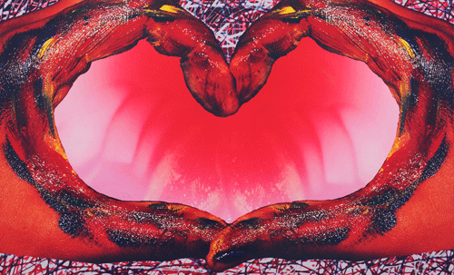
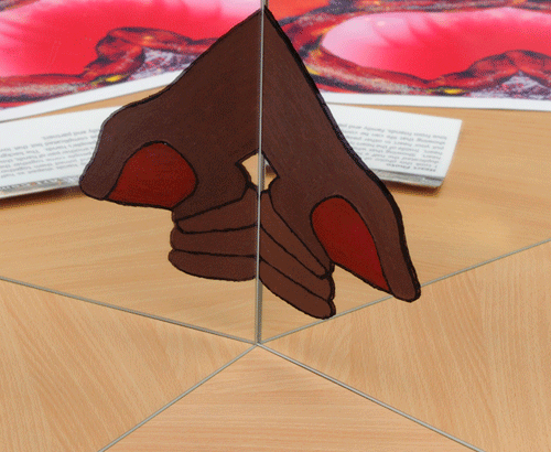
Fixing a Broken Heart
by
Rebecca Dobson
Netherhall Sixth Form College
Entry in the category:
StAges of the Brain
Artist's comments:
I took this photo of one of my hands shaped as half a heart. I then duplicated the half a heart and joined them together creating a whole heart. Showing that when people come together they can fix a broken heart. Inside of the heart is another pair of hands, this is showing that you put your heart in other peoples hands. The background is complicated showing that life can be complicated but that love can make it better, love from friends, family and partners.
Comments from judges:
Broken heart not explored.
Good use of mixed media.
Inventive use of materials; I like the viewer interaction.
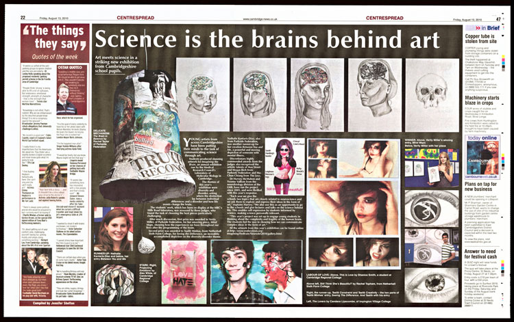
Press Coverage: Cambridge Evening News 13Aug 2010 (larger version)

Schools Award for Science Communication
has been presented to the art departments of
Netherhall School and Sixth Form College
and
The Parkside Federation
Diversity or Disorder
StAges of the Brain
Sponsored by MRC and MRC-LMB:
Poster and banner designs by Paul Margiotta, photographs of art works by Neil Grant,
topic designs by Graham Lingley and exhibition by Brian Tyrrell
Judges for ITB 2010
|
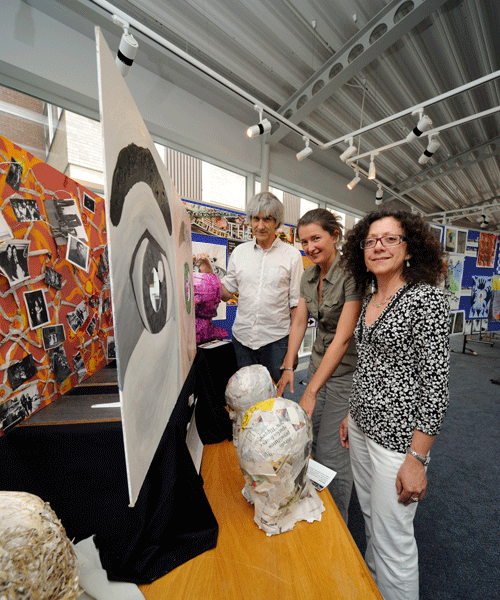
Sarah Campbell, Education Officer, Kettle's Yard, Cambridge (centre) |
| The organizers, Yvonne Vallis and Harvey McMahon would like to thank the exhibitors, teachers and the judges for their participation and once again making the event a success (see exhibit acknowledgements). | |
Poster (large 1.5MB) (Invitation to apply- closed now) |
|
